Import data
Bring in measurements, time series, and operating data from specialist systems, files, databases, and interfaces.
From a flood of data to a manageable situational picture: the factory Data Visualization Portal makes technical bulk data from meters, sensors, assets, error messages, tickets, inspection processes, and specialist systems understandable. Load profiles, time series, heatmaps, and 3D profiles turn into interactive decision visuals for operations, energy management, and the management cockpit.
Measurements become understandable, comparable, and manageable in their object, time, and process context.

Bring in measurements, time series, and operating data from specialist systems, files, databases, and interfaces.
Connect data with meters, assets, sites, customers, buildings, and responsible parties.
Make load peaks, weekly rhythms, consumption patterns, outliers, and changes over time visible.
Systems today deliver an enormous number of individual values. Visualizations complement tables with the specialist context, show patterns directly, and make developments intuitively understandable.
The Data Visualization Portal translates measurements into understandable situational pictures: temporal, spatial, object-based, and management-ready.
An interval meter (RLM) records a customer's load profile at fixed intervals. At a 15-minute resolution, this produces four measurements per hour, 96 measurements per day, and around 8,760 data points in three months.
Several notable consumption peaks are clearly visible in the image. These load peaks provide concrete starting points for specialist analysis and root-cause clarification.
The flood of data is visualized so that 24-hour trends across multiple days become visible. This makes it possible to quickly compare consumption patterns by day, by weekday, and on weekends.
Particularly with interval meters, load-profile data, and 15-minute values, 3D load-profile visualization makes large data volumes understandable: patterns, outliers, peak loads, and recurring consumption profiles become recognizable at a glance.
The image serves as an example. factory visualizes your data so that it produces reliable specialist insights for energy analysis, operations, controlling, and the management cockpit.

The portal presents technical data to match the specialist question: daily profile, heatmap, 3D load profile, management tile, map view, trend line, or deviation chart.
The classic trend over time remains the basis for detailed analysis, plausibility checks, and drill-down.
Heatmaps show intensities, repetitions, and time windows especially fast.
Every day is displayed as a 24-hour slice. Several days together produce a spatial consumption object.
Technical detail data is consolidated into management-relevant information for departments and leadership.
The factory Data Visualization Portal combines data import, object-based data management, visualization logic, history, WatchDog functions, and a management cockpit into one end-to-end solution.
Raw data becomes a manageable situational picture.
The solution uses factory's logic of historized, linked object and data management. This lets visualizations be connected with documents, tasks, workflows, responsible parties, deadlines, projects, assets, and management cockpits.
Measurement data can be taken over from existing sources and placed into defined object structures.
Measurements are not viewed in isolation; they are connected to the relevant business objects.
Defined events can be detected automatically and moved into operational processing.
Based on existing modules, visualization solutions can be configured and extended quickly.
The visualization logic is suited beyond energy data for time series, condition data, error messages, maintenance data, inspection processes, site data, and technical bulk data that need to be understood in an object context.
| Use case | Typical data | Suitable visualization | Specialist benefit |
|---|---|---|---|
| Interval-meter load profile | 15-minute values, consumption, power, peaks | 3D daily profiles, time series, heatmaps | Recognizing consumption patterns, load peaks, and operating hours |
| Energy management | Electricity, gas, water, heat, cost, CO₂ | Dashboards, trends, deviation charts | Managing consumption and cost across sites and periods |
| Asset management | Asset values, conditions, inspections, operating data | Object dashboards, status tiles, time series | Making asset conditions and action needs transparent |
| Facility management | Buildings, rooms, assets, meters, inspection obligations | Map/object view, heatmap, WatchDog | Monitoring sites and technical objects in context |
| Management cockpit | KPIs, trends, deviations, priorities | Status tiles, situational pictures, drill-down | Consolidating technical detail data into decision-relevant visuals |
| Incident management | Error messages, incident reports, tickets, alarms, status codes | Heatmaps, root-cause clusters, time series, priority lists | Recognizing clusters, repeat faults, processing times, and action needs |
| Field service | Deployment sites, service orders, technicians, assets, open cases | Map view, radius search, status tiles, routing and priority logic | Better bundling of on-site appointments, service jobs, and regional tasks |
| Inspection processes | Inspection obligations, inspection results, defects, deadlines, records | Deadline cockpit, object dashboard, traffic-light status, WatchDog | Making inspection status, defect hotspots, and record needs transparent |
The factory Data Visualization Portal is suited for technical specialist processes where large volumes of measurements, condition data, error messages, inspection reports, maintenance data, tickets, or site information arise. This data becomes time series, heatmaps, map views, 3D visualizations, dashboards, and manageable situational pictures.
Visualize network loads, faults, switching states, pressure values, flow rates, temperature trends, and regional anomalies.
Evaluate asset conditions, condition scores, inspection cycles, service life, maintenance costs, and technical asset substance.
Show maintenance orders, downtimes, repeat faults, open actions, and priorities by asset, site, or object class.
Analyze error messages, incident reports, tickets, alarms, status codes, root-cause clusters, and processing times.
Manage events, alarms, shift handovers, operating states, escalations, and action status as a technical situational picture.
Monitor sensor values, temperature, pressure, fill level, vibration, runtime, switching cycles, and threshold values over time.
Visualize inspection obligations, inspection results, defects, re-inspections, deadlines, inspection documents, and technical records.
Manage building conditions, asset status, room climate, elevator faults, fire doors, heating systems, and operator obligations.
Make machine states, downtimes, production volumes, scrap, cycle times, quality values, and line utilization visible.
Evaluate inspection values, defect types, complaints, deviations, root causes, corrective actions, and quality KPIs.
Bring together inspection reports, maintenance records, approvals, document status, validity periods, security levels, and deadlines.
Visualize deployment sites, service orders, technicians, assets, faults, priorities, and open clarification points on a map basis.
Visualization can be connected with further factory modules: from asset management and facility management through the workflow engine and Project Control Center to CRM, document management, and the management cockpit.
Short answers for departments, operations, energy management, asset management, and leadership.
It imports technical bulk data, historizes it, links it to objects, and presents it as interactive charts, heatmaps, 3D models, dashboards, and management situational pictures.
A single interval meter already delivers 96 values per day at 15-minute resolution. Across several months, several meters, or several sites, this produces data volumes whose patterns become especially quickly recognizable visually.
Every day is displayed as its own profile over 24 hours. When these daily profiles are laid out one after another, a spatial consumption object emerges. This makes load peaks, operating hours, weekly rhythms, and outliers very easy to recognize.
Typical sources are CSV, Excel, database exports, REST APIs, specialist systems, SCADA systems, ERP systems, GIS systems, asset management systems, IoT platforms, as well as meter and sensor data sources.
Yes. WatchDog functions can monitor threshold values, missing measurements, notable load peaks, or defined events. This can generate alerts, review tasks, follow-ups, or push notifications.
Suitable processes include network operations, asset management, maintenance, incident management, control-center processes, asset monitoring, inspection processes, facility management, production, quality management, technical record management, and field service.
Yes. Error messages, incident reports, tickets, alarms, maintenance orders, and service reports can be imported, structured, linked by object and site, and visualized as heatmaps, time series, root-cause clusters, priority lists, or management situational pictures.
Energy data management (see above) is one example.
The logic is equally suited to many technical processes, for example:
Network operations, asset management, maintenance, incident management, control-center processes, asset monitoring, inspection processes, facility management, production, quality management, technical record management, and field service. Wherever measurements, condition data, error messages, inspection reports, maintenance data, or site information arise, visualizations can make patterns, clusters, deviations, priorities, and action needs visible.
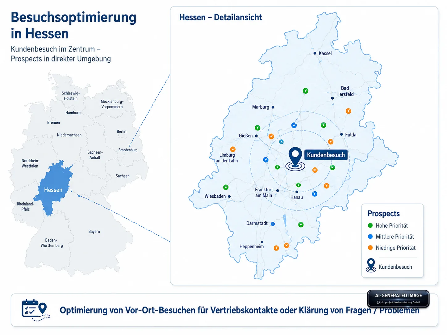
Sales & customer care: A map section shows a planned customer visit and visualizes associated prospects within a defined radius. This makes additional sales contacts, clarification appointments, and on-site visits easier to plan.
We configure data import, object structure, visualizations, WatchDog logic, and the management cockpit to match your existing data sources. Let's talk about your measurement data, meters, assets, sites, and evaluation questions.
Map-based data visualization helps sales and customer care
connect planned customer visits with nearby prospects, partners, or open cases needing clarification.
In doing so, the portal can select and provide exactly the relevant data for each account manager – for example assigned customers, regional prospects,
open transactions, priorities, status information, and clarification needs within a defined radius.